
Orbit
Use Orbit
Investigated the challenge of working across multiple pursuits and used AI-assisted prototyping to rapidly explore potential solutions. This case study captures what v0 generated, what worked surprisingly well, and how I refined the experience further.
When you're deep in one pursuit, really in it, switching doesn't just cost you focus. It costs you energy. You start comparing yourself to someone who does only that thing full time. You feel behind. And the hardest part is trusting that pausing isn't quitting. So I wanted to build something that made that switch feel safe, not like an interruption, but like a return.
In 4 minutes and 31 seconds, it generated a full prototype. Project management, categories, progress tracking, even a Context Switch Assistant. A lot of it was genuinely impressive.
The Context Switch Assistant didn't just surface where a project was left off, it created a pause before entering one.
A loading moment, a few context cues, a nudge: get back with the right mindset. That small intervention is intentional.
Grounding before switching, even for two seconds is what separates chaotic multitasking from intentional momentum. v0 understood this without being told.
Every project had a status chip, Active or Paused. Two words, but they did something quietly powerful. When life pulls a multi-passionate person away from one pursuit, the mind starts asking: am I abandoning this? That chip answers it.
It's not gone. It's waiting. That's the kind of emotional reassurance good design offers without announcing itself.
The project cards were doing too much. Descriptions, context snippets, completion percentages, all competing at once.
So I refined it: stripped the cards back to what actually matters, only title, status, time invested, last active.
Hover states were identical across button types.
The secondary buttons had hover states with primary button background colour. It did not fit in well. The same applied for the category chips as well.
I worked on that refinement as well.
"Passion Manager" felt like a productivity tool, something to be optimised, tracked, managed. That wasn't the point.
The rename to Orbit came from the idea of moving between multiple pursuits while always having a centre to return to. Not juggling. Orbiting.
The colour shift followed the same logic. Green read as active, task-driven. Replacing it with lavender brought the tone down. Subtle, calm, intentional. A palette that's calm but present.
Philosopher Joel Uili, writing in his Career Archetype series, argues that multi-passionate people aren't better served by narrowing their focus, they're better served by finding an anchor point that holds them steady while they freely pursue multiple interests. Over time, that cross-domain curiosity creates an overlap of knowledge that specialists simply can't access.
He points to Joseph Campbell, mythologist, writer, student of literature, cinema, religion, and psychology as proof. Campbell's range is precisely what made the Hero's Journey possible. Had he been told to pick one lane, Star Wars as we know it might not exist.
— Joel Uili, Why Multi-Passionate People Need to Approach Mastery Differently, Career Archetype Series
Identifying the opportunity
Citation
The product
What blew my mind
Critique and changes
Wrap up
Selected state/Primary CTA would look this way
This is how the secondary button hover state looked
Secondary button hover state with a light gray background




Pop while it loads
It started with a chocolate.
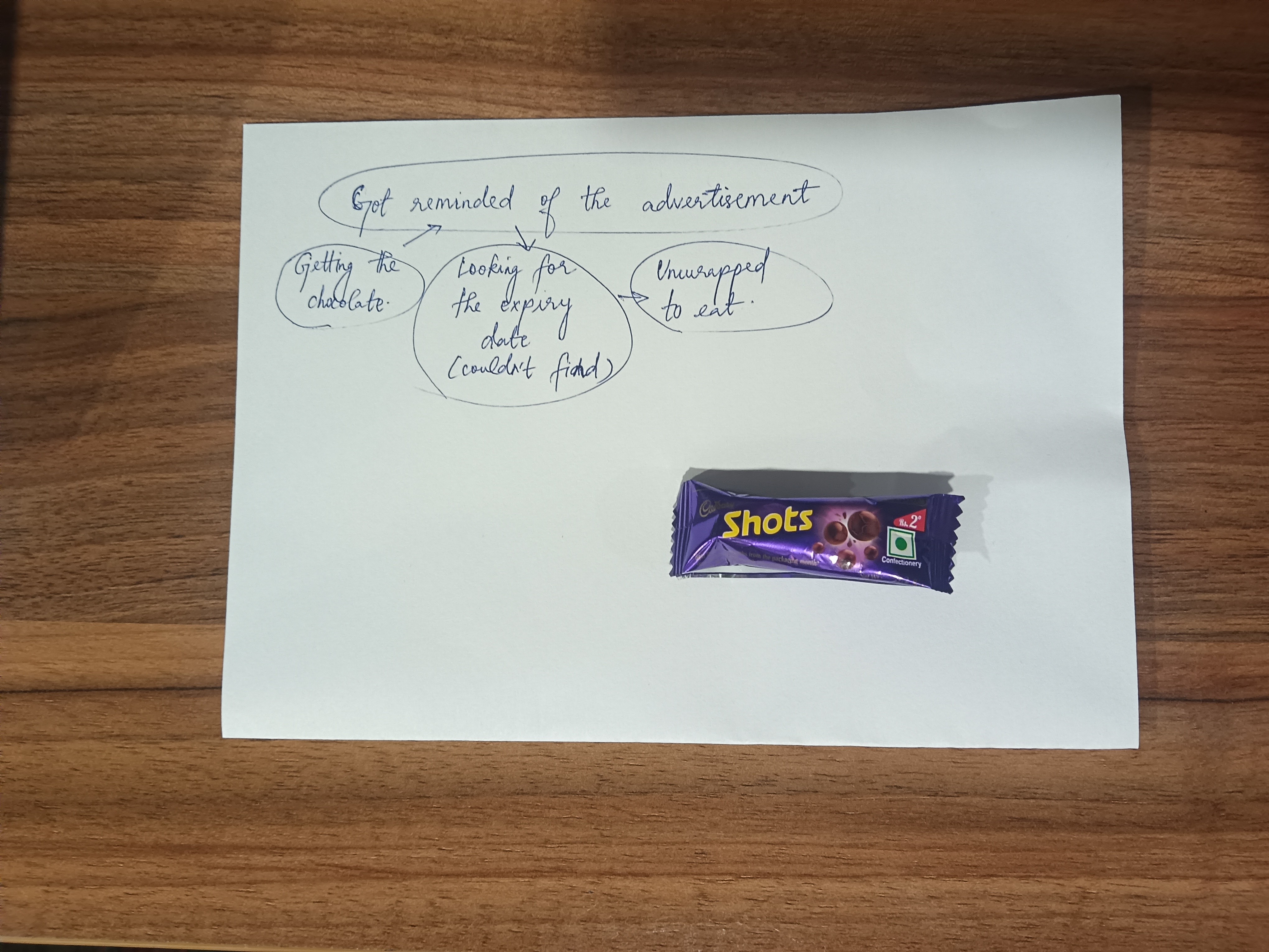
During a design trial on user delight at Rocketium, everyone in the room was handed the same Cadbury dairy milk shots. Same product. But the moment we mapped our individual flows to eating it, something became clear, no two were alike. For some, delight was in the unwrapping. For me, it was a childhood ad that surfaced the instant I held it. A jingle. A memory, watching it with my grandparents.
Looking for a natural place to introduce it, the answer turned out to be a moment most products ignore entirely, the wait. Those few seconds while AI generates content, where users have nothing to do but watch a loader.
Built using Lovable, Pop While It Loads turns that pause into a small game. Bubbles and balloons appear while content generates. Pop them. A soft sound plays. A little feedback. Nothing that pulls focus, just something that makes the wait feel alive.
When shown to two people, the insight proved itself again.
One played with pure delight.
The other immediately noticed that popping near the edge of a bubble didn't register and pointed it out, mid-smile.
Same product. One felt joy. One found a bug. Both responses were valid.
And both, in their own way, were delight.
That exercise left one insight behind: delight is deeply personal, and often lives outside the product itself.

Memeverse
The brief was loose, reimagine Rocketium's empty states with a distinct visual personality.
Early directions floated Alice in Wonderland, Star Wars. Then the cofounder nudged the team toward memes.
That one suggestion changed everything.
After exploring references, we landed on Flork, the stick-figure meme style known for its deadpan expressions and absurd relatability. The fit was immediate.
For the 404 page, tried generating a short video using Gemini.
My contribution was the copy and illustrations. Having a mapped list of empty states, copy options were drafted with the help of ChatGPT and narrowed down. Those lines, paired with Flork references, were fed into both ChatGPT and Gemini to generate the illustrations.
A design team side exploration

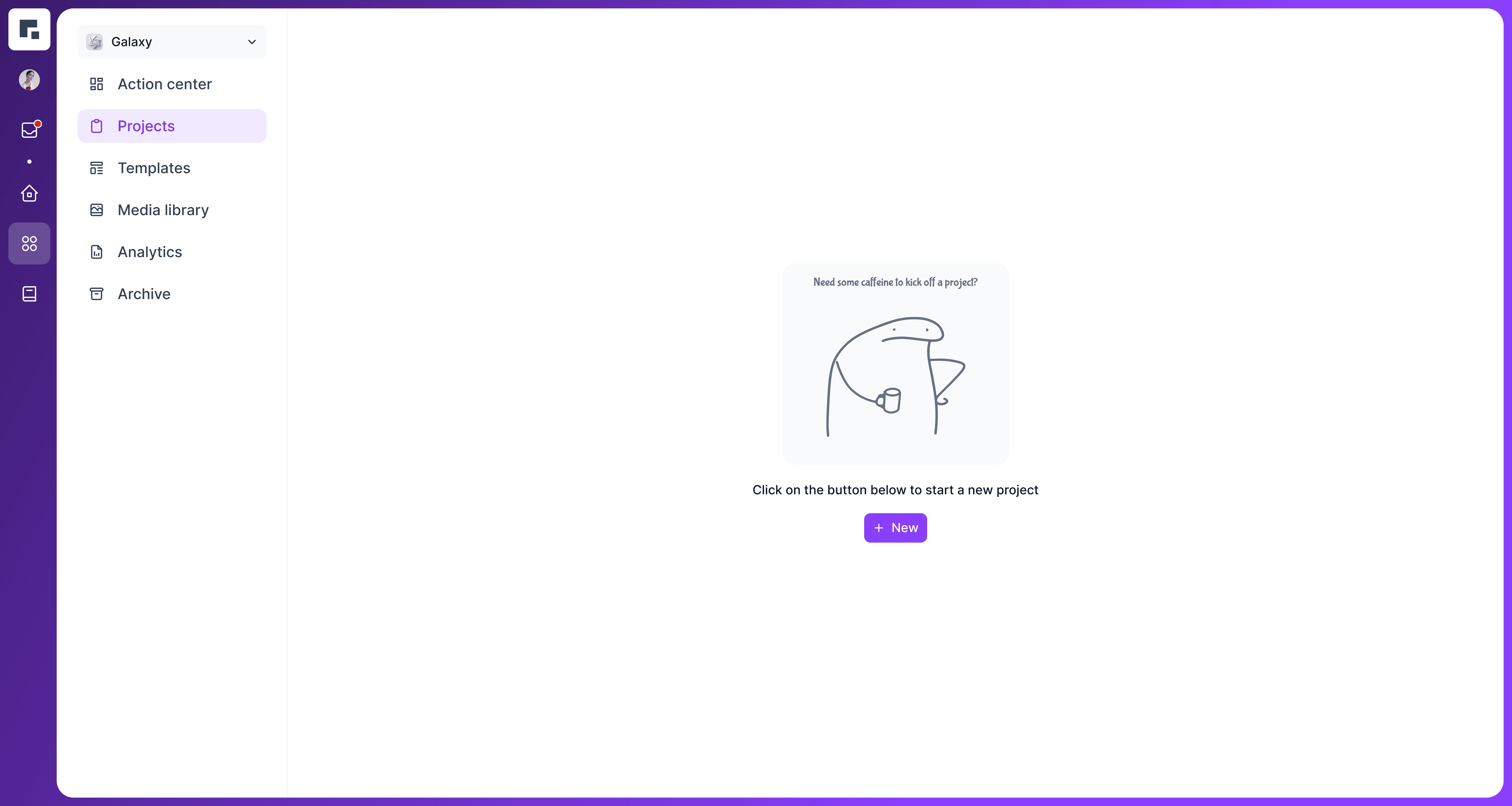


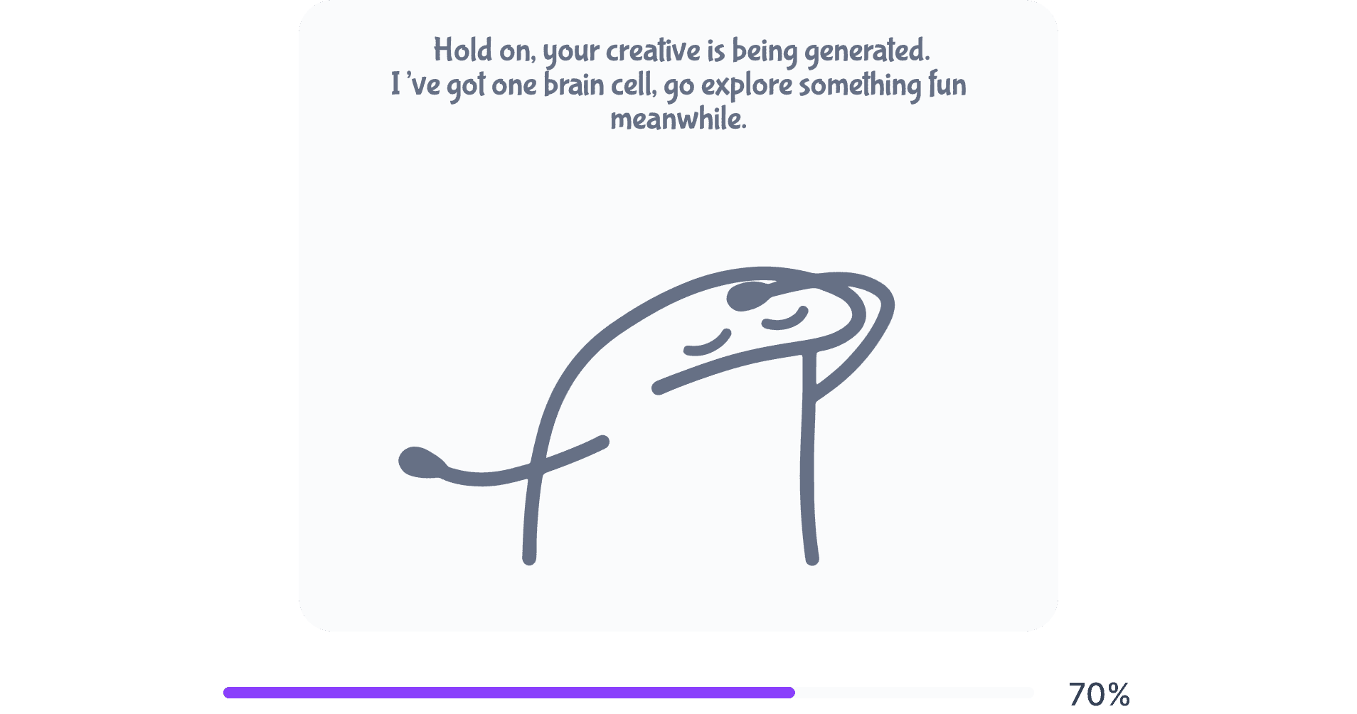

Each empty state got its own moment: a little character, a little copy, a little personality in places the product had previously gone quiet.
Word Grid
Growing up, magazine puzzles always ended in a conversation. When the brief arrived, one question followed: what if the poster itself was the game?
A crossword. Each clue led somewhere on Rocketium's site. To solve it, people had to explore.
Multiple AI tools. Broken grids. Clues that wouldn't align. Only Lovable came close , splitting the across and down grids into a clean SVG.
In hindsight, a word search would have been simpler, fill the alphabets, let people circle the answers, done. But that route wouldn't have led to testing tool after tool, understanding what each could and couldn't do. The harder path taught more. 💪
The posters went up. A day passed. No interaction. Then we taped a pencil next to it and people stopped, solved, talked.
The pencil did what the design was trying to do all along.


D
H
A
Y
A
N
Wait, before you go!
Thank you for showing interest in going through my case study. While I'm still working on the mobile version, it's currently best experienced on a desktop. I'd love for you to view it there.